EDA on Titanic: Machine Learning from Disaster
Learning the basic EDA techniques in Machine Learning

Perhaps most of us tried hands-on data analysis through the Titanic: Machine Learning from Disaster Kaggle competition. This was my first data science project as well. Through this article, I go through the various ways we can perform EDA on the given data.
I started this project just one month into learning Data Science, with almost no prior experience with Machine Learning, and just some knowledge from a few online courses that I had been attending.
If you’re only interested in the final Classification Algorithms and how I’ve applied them, then check out Part-2 for this article here.
The Challenge:
We are given 2 sets of data: A training set, train.csv, and a testing set, test.csv. The training set has information related to the passengers aboard the Titanic along with the answer to whether they survived the shipwreck or not. While the test data contains only the passenger information. We have to use the training data to make a model that can predict the chances of survival for the passengers in the testing data.
Our training data looks like this:

And our testing data is like this:

For EDA, we try to find the relationship between each of the features and the Survival column, we make use of various data cleaning and visualisation techniques -
1. Name Vs Survival Rate
Our data set has names with prefixes like “Mr.”, “Mrs.”, “Miss” and so on, this will affect a person’s survival rate as it is known that Females had a better chance of survival compared to males. During the shipwreck, women and children were allowed to get on the boats first. We try to test our theory with a bar graph.
survived = train[train["Survived"]==1]["Sex"].value_counts()
dead = train[train["Survived"]==0]["Sex"].value_counts()
df_sex = pd.DataFrame([survived,dead])
df_sex.index = ["Survived","Dead"]
df_sex.plot(kind="bar",stacked = True, figsize = (8,4))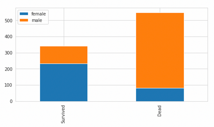
The chart confirms that males have a lesser chance of surviving compared to females. Prefixes like “Mr.”, “Sir.” would have lesser chance of survival compared to Prefixes like “Miss.”, “Mrs.” Any other prefixes like “Rev” or “Dr.” can be put into a separate category.
We extract the prefixes from the Name column and create a new numeric feature to store its relation with the chances of survival.
combined_data = [train,test]

for data in combined_data:
    data["Prefix"] = data["Name"].str.extract(' ([A-Za-z]+)\.', expand = False)
Now, we define a mapping that depicts the relation of the prefix with the chances of survival.
- Mr, Master as 0
- Miss, Mlle, Ms as 1
- Mrs, Mme, Lady as 2
- Others as 3
Prefix_mapping = {"Mr":0,"Miss":1,"Mrs":2,"Master":0,"Dr":3,"Rev":3,"Major":3,"Mlle":1,"Col":3,"Capt":3,"Sir":3,"Ms":1,"Lady":3,"Mme":2,"Countess":3,"Jonkheer":3,"Don":3}for data in combined_data:
    data["Prefix"] = data["Prefix"].map(Prefix_mapping)
The resulting dataset now has a numeric column with the information from the Name feature.

2. Cabin Vs Survival Rate
We first see how many null values are there in the Cabin column of our train data set :
import seaborn as sns

sns.heatmap(train.isnull(), yticklabels = False, cbar = False)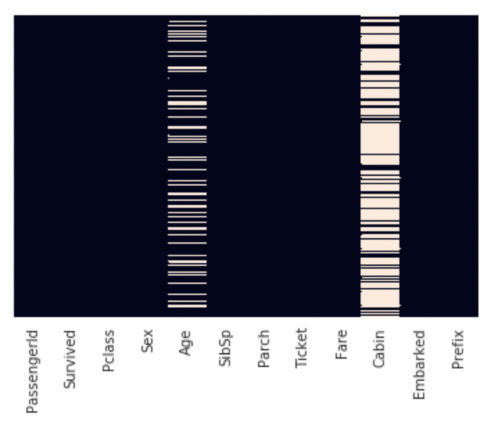
train["Cabin"].isnull().value_counts()
>True     687
>False    204
>Name: Cabin, dtype: int64
So there are 687 missing values. Therefore, most of the values in the Cabin column are missing. We can drop this feature, however, we check to see if there is any relation between the Cabin value missing for a row and the chances of survival of that passenger.
We replace all missing values of Cabin with 0 and rest of the values by 1, then plot it with Survived.
train["Cabin"] = train["Cabin"].fillna(0)
for i in range(891):
    if(train.at[i,"Cabin"]!=0):
        train.at[i,"Cabin"]=1
sns.countplot(x = "Survived", hue = "Cabin", data= train)
Also plotting a bar graph for the same-
survived = train[train["Survived"]==1]["Cabin"].value_counts()
dead = train[train["Survived"]==0]["Cabin"].value_counts()
df_cabin = pd.DataFrame([survived,dead])
df_cabin.index = ["Survived","Dead"]
df_cabin.plot(kind="bar",stacked = True, figsize = (8,4))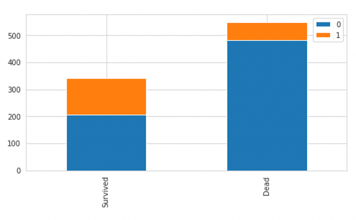
We can see that Cabin has too many Null values, but most passengers that did not survive also didnt have a cabin number, therefore, we can code our data as-
Having a Cabin : 1
Not Having a Cabin : 0
This will allow our model to derive some information from a missing cabin number, i.e, if the passenger has a missing Cabin Number, they had a lower chance of surviving.
This can be interpreted in the way that- if a passenger survived, then they would have mentioned their cabin number while the data was being collected. However, for those that didn’t survive, the Cabin Number was not known.

3. Passenger Class Vs Survival Rate
Let us vizualise the data to see if the class of the passenger impacts the survival rate or not:
sns.set_style("whitegrid")
sns.countplot(x = "Survived", hue = "Pclass", data = train)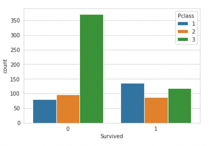
From the bar plot, it is clear that the passengers from First Class had a higher chance of surviving. The majority of the passengers in the Third Class did not survive. Therefore, Passenger Class is an important factor while predicting the survival rate of the passengers.
The feature is already numerical, so it can be directly passed to any ML model during training.
4. Age Vs Survival Rate
Firstly, we check for NULL values in the Age column.
sns.heatmap(train.isnull(), yticklabels = False, cbar = False)
Age has a few null values which should be filled up. We could fill each missing value with the mean Age, however, we can also assume that most of the First Class passengers must have been of greater age than the Third class passengers. Since Passenger Class is an important factor for predicting the chances of survival, we can take a different approach.
plt.figure(figsize=(10,6))
sns.boxplot(x="Pclass",y="Age",data=train)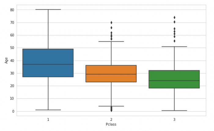
This box plot makes it clear that the mean Age of first-class passengers is higher than those in second or third class. We calculate these ages and get the following results:
Average age for First class Passenger :  38.233440860215055
Average age for Second class Passenger :  29.87763005780347
Average age for Third class Passenger :  25.14061971830986
We now write the code for replacing the missing values in the Age column depending on the Passenger class of the passenger. That is, if the Passenger is from first class and has their age missing, it should be replaced with the mean age of the first class passengers, and same for second and third class passengers.
avg_first = train["Age"][train["Pclass"]==1].mean()
avg_second = train["Age"][train["Pclass"]==2].mean()
avg_third = train["Age"][train["Pclass"]==3].mean()for data in combined_data:
    data["Age"] = data["Age"].fillna(0)

for i in range(891):
    if(train.at[i,"Age"]==0):
        if(train.at[i,"Pclass"]==1):
            train.at[i,"Age"]=avg_first
        elif(train.at[i,"Pclass"]==2):
            train.at[i,"Age"]=avg_second
        else:
            train.at[i,"Age"]=avg_third
for i in range(418):
    if(test.at[i,"Age"]==0):
        if(test.at[i,"Pclass"]==1):
            test.at[i,"Age"]=avg_first
        elif(test.at[i,"Pclass"]==2):
            test.at[i,"Age"]=avg_second
        else:
            test.at[i,"Age"]=avg_third
Once done, we have the Age column without any missing values.
We now try to derive some insights about which age group has a higher chance of survival:-
fac = sns.FacetGrid(train,hue = "Survived", aspect = 5)
fac.map(sns.kdeplot,'Age',shade=True)
fac.set(xlim=(0,train["Age"].max()))
fac.add_legend()
Looking at this Facet Grid closely for passengers in Age group 0–20, 2–30 and 30 above:
Age Range: 0–20

Age Range: 20–30

Age Range: 30 above

Observation :
- Younger people, age 0–20 are more likely to survive than to die
- People in the age group of 20–30 are more likely to die
- Older people will more likely survive
In general, the young adult passengers have the highest probability of dying compared to children and older adults.
5. Sex v/s Survival Rate
We try to see if the sex of a passenger has anything to do with their survival rate. We know that Women were sent to the escape boats before men, so this could effect the chances of survival of a passenger.
survived = train[train["Survived"]==1]["Sex"].value_counts()
dead = train[train["Survived"]==0]["Sex"].value_counts()
df_sex = pd.DataFrame([survived,dead])
df_sex.index = ["Survived","Dead"]
df_sex.plot(kind="bar",stacked = True, figsize = (8,4))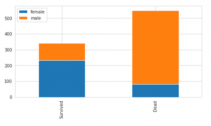
Observation : Male passengers have a higher chance of dying compared to female passengers.
We can encode the data in the following way :
Female : 1, Male : 0
dummy = pd.get_dummies(train["Sex"])
train["Sex"] = dummy["female"]
We can perform the same on the testing data as well.
6. Embarked V/s Survival Rate
The Embarked column has 3 categorical values. To use this column for data analysis, we will have to encode them. We can create 2 additional columns for the Embarked values as these two columns can depict the 3 categorical values.
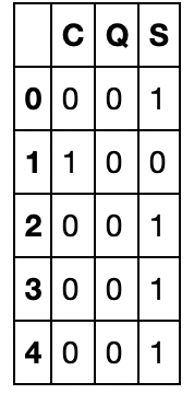
emb_dummies = pd.get_dummies(train["Embarked"])
train["Q"] = emb_dummies["Q"]
train["S"] = emb_dummies["S"]
train.drop(columns="Embarked",inplace = True)
The reason why we only add 2 columns instead of 3 is because the values of these 2 columns can be used to interpret the third column. When Q and S are both zero, it means the value if C is 1.
7. PassengerId Vs Survival Rate
The ID of the passenger has nothing to do with the survival rate as it is a unique value for each passenger. We drop this value.
train.drop(columns = "PassengerId", inplace = True)
test.drop(columns = "PassengerId", inplace = True)
8. Ticket Vs Survival Rate
The Ticket of the passenger has nothing to do with the survival rate. Ticket values will have a large number of categorical values which do not provide us with the right information to predict whether a passenger survived or not.
People will likely have different Ticket Numbers.
We can drop this value. However those that want to go into a deeper analysis can extract the first letter in the Ticket of each passenger and try to find a relationship with the chances of survival, similar to what we did with the Name-Prefix or each passenger.
train.drop(columns = "Ticket", inplace = True)
test.drop(columns = "Ticket", inplace = True)
9. Fare v/s Survival Rate
We analyse the amount of money each passenger paid for their ticket and try to find if this affects the survival rate of the passenger.
plt.figure(figsize=(5,8))
sns.boxplot(x="Survived",y="Fare",data=train)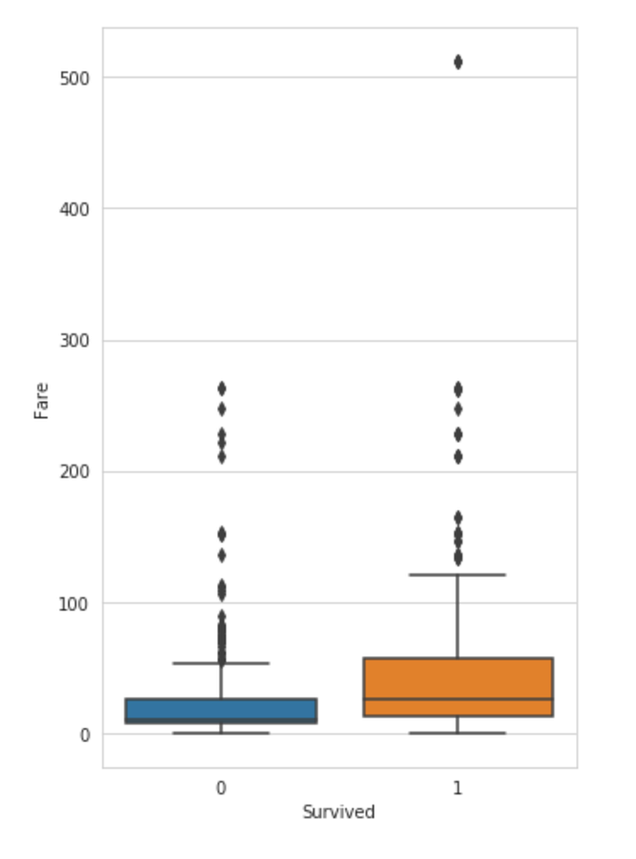
Observation :
The average money spent on the ticket was more for the passengers that survived.
Also, we can find if the feature has any null values using the .isnull() method. This training data has 1 null value which can be replaced with the mean of all the fares. However, if there are more missing values in the testing data. we need to perform a better imputation technique.
We try out the same technique as we used for the Age column, i.e using the mean of the fares for the respective passenger class.
fare_first = train["Fare"][train["Pclass"]==1].mean()
fare_second = train["Fare"][train["Pclass"]==2].mean()
fare_third = train["Fare"][train["Pclass"]==3].mean()print("Average Fare for First class Passenger : ",fare_first)
print("Average Fare for Second class Passenger : ",fare_second)
print("Average Fare for Third class Passenger : ",fare_third)

test["Fare"] = test["Fare"].fillna(0)

for i in range(418):
    if(test.at[i,"Fare"]==0):
        if(test.at[i,"Pclass"]==1):
            test.at[i,"Fare"]=fare_first
        elif(test.at[i,"Pclass"]==2):
            test.at[i,"Fare"]=fare_second
        else:
            test.at[i,"Fare"]=fare_third
Now, we look at the distribution of the fares paid by those that survived and those that did not-
fac = sns.FacetGrid(train,hue = "Survived", aspect = 5)
fac.map(sns.kdeplot,'Fare',shade=True)
fac.set(xlim=(0,train["Fare"].max()))
fac.add_legend()
plt.xlim(0,100)
People who paid a lower fare were most likely from Second or Third class and therefore had a lesser chance of surviving, since first-class passengers were allowed to get onto the escape boats first.
10. SibSp and Parch V/s Survival Rate
SibSp and Parch both represent the same thing, i.e, the family size of the passenger. These can be added to create a single feature. Also, to avoid non-zero values, such as, if a person is travelling alone, 1 can be added to the result.
train["Family"] = train["SibSp"] + train["Parch"] + 1
test["Family"] = test["SibSp"] + test["Parch"] + 1

for data in combined_data:
    data.drop(columns = ["SibSp","Parch"],inplace =True)
Now we can plot a bar graph to see if the family size had any effect on the survival chances of the passengers.
plt.figure(figsize = (12,6))
sns.set_style("whitegrid")
sns.countplot(x = "Survived", hue = "Family", data = train)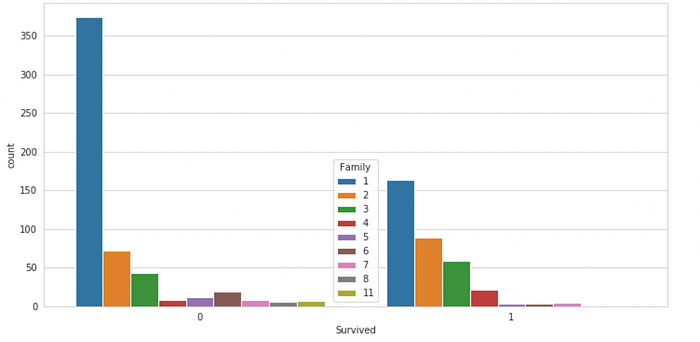
Observation :
People who were travelling with someone had more chances to survive compared to those who were travelling alone.
We’re Done!
And there we go! We’re done with the complete EDA and data sanitization! Now we can scale/normalize our data and use any of the classification algorithm available to us. The techniques used in this project are beginner friendly and work on most types of data. So you can pick which technique works for you best!
Now, if you’re interested in knowing which algorithms works the best, then I have a full article on applying 7 different classification algorithms on this dataset. You can check that out now!
Have fun in your EDA journey!
Check out the complete code on my GitHub:
